Long after this post was written, a fellow by the name of Patrick Jones left a comment which showed another way to implement the functionality shown in this post. Upon reading his clever implementation, I realized that this is entirely possible to achieve without writing a single line of code. The trick relies on binding the Expander’s header element’s Width to the ActualWidth of the Expander. Here’s a demo:
<Expander>
<Expander.Header>
<TextBlock
Text=”I am header text…”
Background=”Blue”
Width=”{Binding
RelativeSource={RelativeSource
Mode=FindAncestor,
AncestorType={x:Type Expander}},
Path=ActualWidth}”
/>
</Expander.Header>
<TextBlock Background=”Red”>
I am some content…
</TextBlock>
</Expander>
Note: This technique makes the header element wider than the available space (it does not subtract out the width of the Expander’s expansion indicator). If your header element has a border around it, such as a Button, this XAML-only technique will not work properly because the header element is clipped on the righthand side. If you need the header element to be exactly the right width, then you will need to use the approach explained below.
[/EDIT]
Someone recently asked me how to stretch the content of an Expander’s header. By default the Expander will force the header’s content to “auto-size” itself, like this:

In the screenshot above, a DataTemplate was applied to the Expander’s HeaderTemplate property. That template consists of a Border with a blue background wrapping a ContentPresenter. Notice that the Border does not extend all the way to the right edge of the header area. The desired effect is to have the header content stretch, like this:

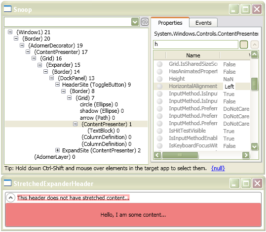
I first tried to make the header content stretch by setting properties on the Border in the DataTemplate. No matter which properties I set it had no effect, so I realized that a little Snooping was necessary to get to the bottom of this. I fired up Snoop and soon realized why I could not stretch the header content. The ContentPresenter which hosts the expanded HeaderTemplate elements (note, ‘expanded’ in the sense of ‘instantiated’) has its HorizontalAlignment explicitly set to ‘Left’. D’oh!
Here’s what I’m referring to, when using the Expander’s default HeaderTemplate:
(click me)
The question now is: how can we set that ContentPresenter’s HorizontalAlignment to ‘Stretch’?
I know of two good ways to go about setting that property. We could get a copy of Expander’s default control template (for each OS theme…), find the ContentPresenter in the template, set the HorizontalAlignment to ‘Stretch’, and then use that modified control template in our application. For you XAML-only zealots out there, that’s the way to go.
Alternatively, if you are not restricted by a XAML-only rule, you can perform a little kung fu in the code-behind to make it happen. Here’s the magic:

(click me)
You can download the demo project here. Change the file extension from .DOC to .ZIP and then decompress it.


 Josh Smith on WPF
I struggled with this also, and came up with what is (I think) an even better method. It combines a binding with a converter, and allows you to do all of the kung-fu in XAML (except, of course, for defining the IValueConverter class).
Start with the converter:
class ExpanderHeaderWidthConverter : IValueConverter
{
#region IValueConverter Members
public object Convert(object value, Type targetType, object parameter, System.Globalization.CultureInfo culture)
{
double width = (double)value;
double diff = -25.0;
if (parameter != null)
{
Double.TryParse(parameter.ToString(), out diff);
}
return width + diff;
}
public object ConvertBack(object value, Type targetType, object parameter, System.Globalization.CultureInfo culture)
{
double width = (double)value;
double diff = -25.0;
if (parameter != null)
{
Double.TryParse(parameter.ToString(), out diff);
}
return width – diff;
}
#endregion
}
Use the converter in markup:
Voila! WPF has been faked out in spite of itself.
Thanks Patrick. Unfortunately the XAML did not make it through (must have been munged by the HTML processing). If you get a chance, please drop the XAML in a file and post a link to it. I’m curious to see the complete example.
Thanks,
Josh
OK — the XAML markup was stripped out. Curse of the angle brackets. Here it is again, assuming it treats HTML entities correctly:
<Expander HorizontalAlignment=”Stretch” VerticalAlignment=”Stretch”>
<Expander.Header>
<Button Width=”{Binding Path=ActualWidth, Converter={StaticResource ExpanderHeaderWidthConverter}, ElementName=StackPanel, Mode=OneWay}” Content=”Button”/>
</Expander.Header>
<StackPanel x:Name=”StackPanel”/>
</Expander>
Hey Patrick, thanks for the great idea! After seeing your approach, I realized that it is easy to take it one more step and remove all the code. 😀
I’ve updated this blog post, showing the XAML-only way.
Josh
[…] Content in an Expander Header (take two) A while ago I posted a blog entry called Stretching Content in an Expander Header which discussed a way to make the content of an Expander’s header occupy all available space […]
Hey Josh,
I think there is a problem with the XAML-only way. Try it with a button in the header and you will see that the right side of the button is cut off. That is because binding to the width of the control does not take into account the 25 pixels or so taken up by the toggle button in the header. That’s why I used the value converter to subtract some from the total width.
— Patrick
Patrick,
Yeah, that is true for a header which contains a Button. I was updating my sample, where the header content is just a simple TextBlock. For that example, the XAML-only approach works OK.
In the case of using a Button, or any element with a border around it, I suppose you should use my original technique. The problem with your technique is that it hard-codes the expansion indicator’s width. Since the indicator could be swapped out with a different element via templating, that approach is too brittle.
Thanks again,
Josh
Hello,
is there a similar way how to move the expander’s toggle button on the opposite side? I mean like when you set FlowDirection=RightToLeft, but without using this property.
Jan
Jan,
The ToggleButton can only be “moved” by applying a custom control template to the Expander. If I remember correctly, the ToggleButton is in a Grid with two columns (one for the ToggleButton, another for the header content). If you were to get a copy of Expander’s default template, you could tweak it so that the columns are swapped.
Josh
re: hard-coding the expansion indicator’s width in the IValueConverter:
Actually, it is not hard-coded. It hard-codes a reasonable default (25), but it also checks the parameter argument for an override. This override could then be bound to the ActualWidth property of the relevant expansion control in the template.
Patrick,
Good catch. I missed that point when I looked it over the first time.
Josh
Hello,
I’m trying to have a cross functionality of a expander and a grid splitter. by that I mean, I’d like to have the content in the splitter be partially shown. When the user click the button the expander opens completely…Any ideas???
Josh,
You’re a continued source of inspiration when it comes to WPF. Thank you so much!
Chris
Thanks a lot, Chris! That’s a very nice thing to say. 😀
Josh
Hi,
I had a similar problem with non-stretching headers in treeviewitems, and though this looks like the same problem, I couldn’t get your fix to work. (In your example I swapped a treeview and treeviewitem in place of your expander)
Any clues?
Dan
hi,
how can i change the style of the + expander in wpf treeViewer?
(instead of displaying + i want for example |>)
Josh,
Just a quick note on your Stretch a Expander Header (way back in Feb 2006). A xaml only solution to change the HorizontalAlignment of the ContentPresenter from Left to Stretch is listed below. The key to the solution is the Binding in the DockPanel which uses Mode=OneWayToSource. And Bea Costa said she couldn’t think of any use for OenWayToSource, sheesh, hehehe 🙂 BTW, I really enjoy your blogs…
-Expander.Header-
!– DockPanel HorizontalAlignment Binding (OneWayToSource)
sets ContentPresenter ancestor to “Stretch”
—
-DockPanel Background=”AliceBlue”
HorizontalAlignment=”{Binding HorizontalAlignment,
RelativeSource={RelativeSource FindAncestor,
AncestorType={x:Type ContentPresenter}},
Mode=OneWayToSource}”
–
-TextBlock FontWeight=”Bold” Text=”{Binding Path=Name}”
Margin=”5 2 2 2″ MinWidth=”150″/-
-TextBlock FontWeight=”Bold” Text=”{Binding Path=ItemCount}”
Margin=”2″/-
-/DockPanel-
-/Expander.Header-
Patrick your solution saved me a world of hurt.
Many thanks!